En

 Download ParkUsher Free
A parking map is only useful if everyone can read it.
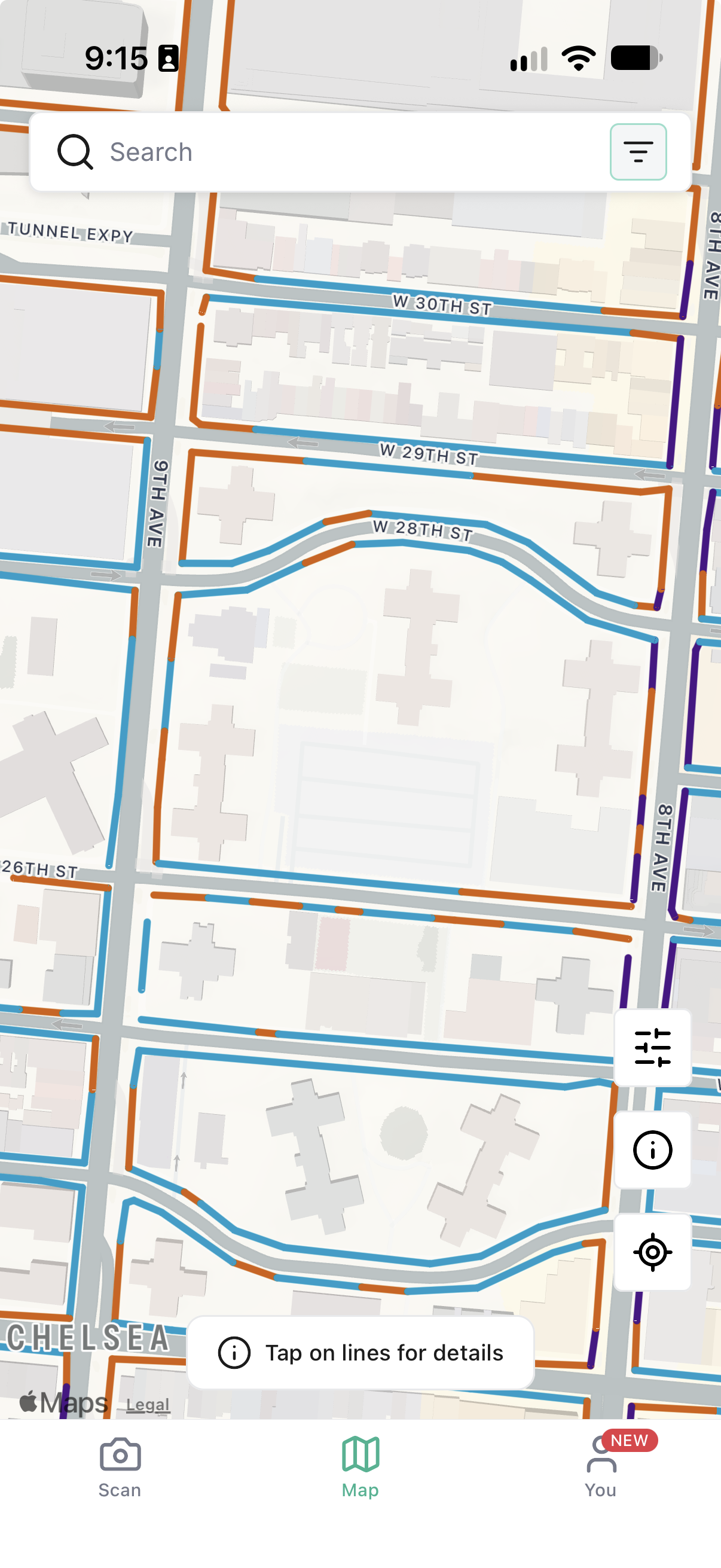
ParkUsher Colorblind Mode is an accessibility setting that lets drivers replace the map’s standard red and green parking lines with a red-green-friendly palette or a grayscale view. It changes how the map looks—not the parking information behind it and can be turned on under You → Settings → Accessibility. The feature is available across all seven cities where ParkUsher operates.
When we first launched the ParkUsher real-time parking map, we used a simple colour system to make complicated parking rules easier to understand. Green lines showed where parking was allowed, red lines showed where it was restricted, and blue lines identified paid parking.
For many drivers, that made parking feel instantly clearer. But not for everyone.
Drivers with red-green colour vision deficiency told us that some of those lines could be difficult to tell apart. That matters when you are trying to make a quick decision on a busy street. Nobody should have to squint at a map, second-guess what they are seeing, or risk a parking ticket because an app was not designed with them in mind.
So we listened. ParkUsher now includes Colorblind Mode, with alternative map palettes designed to make parking information easier to distinguish.
Street parking rules are already complicated. A single block can include time limits, paid parking, permit restrictions, street cleaning, and no-stopping periods. ParkUsher’s map turns those rules into clear lines that drivers can understand at a glance.
But red and green are not equally distinct for every person. According to the National Eye Institute, the most common type of colour vision deficiency makes it difficult to tell the difference between red and green.
That created a gap between what our map was meant to do and what some users experienced. The information was there, but it was not as easy to read as it should have been.
Accessibility means closing that gap.
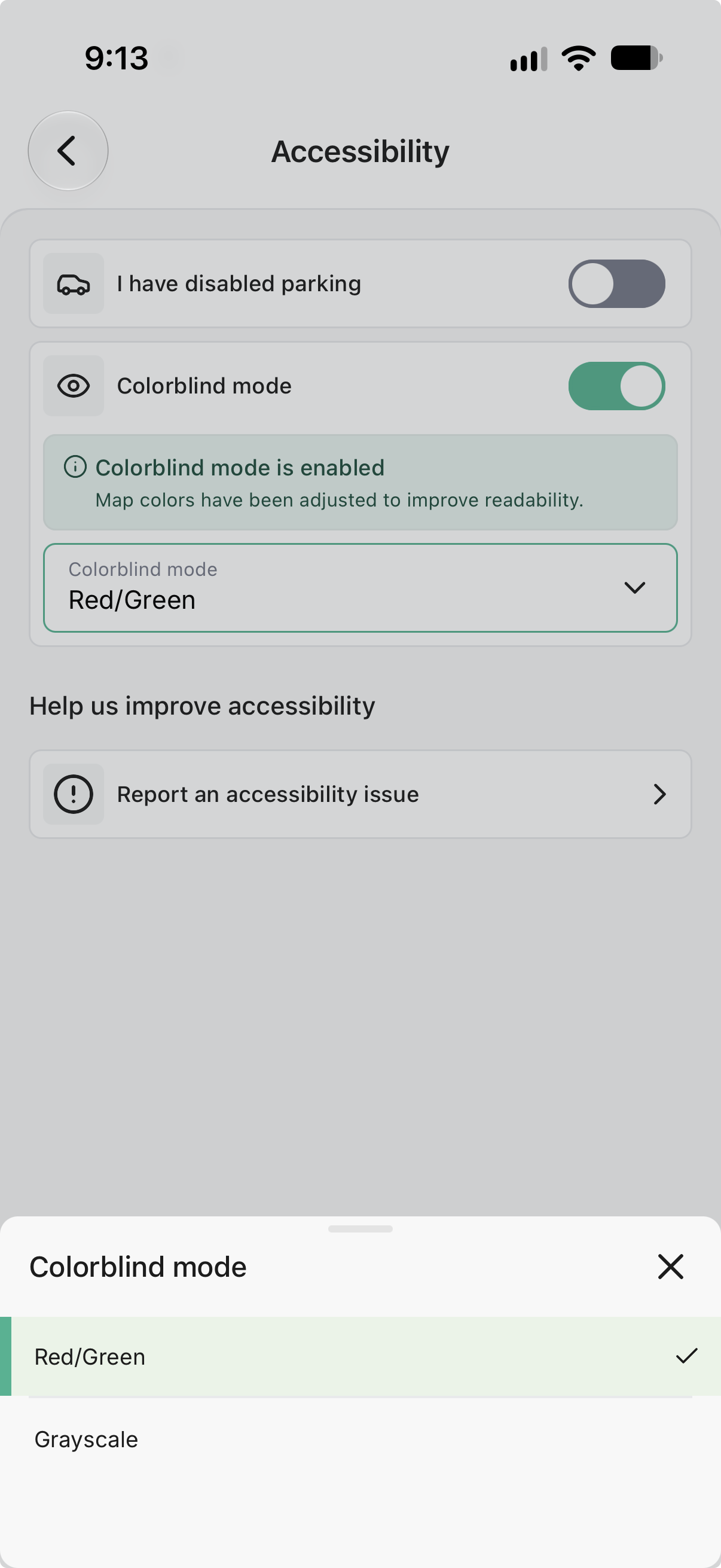
Colorblind Mode changes the way parking lines appear on the map without changing the parking information behind them.
Drivers can choose the display that works best for them:
The same streets, parking rules, and real-time information remain in place. Only the visual presentation changes.
Drivers can also tap any line on the map to open its parking details. The colour gives you a quick visual signal, while the line details give you the exact rule before you park. This reflects an important accessibility principle: colour should not be the only way important information is communicated, as explained by the W3C Web Accessibility Initiative.
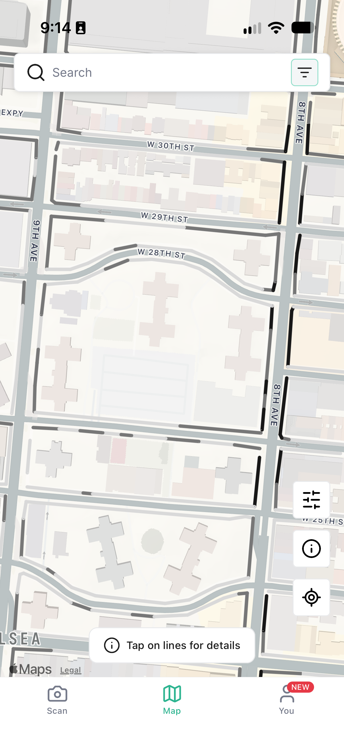
You can adjust the map in a few quick steps:
The map will update to your selected palette. You can return to Accessibility settings and change it whenever you want.
You can also report an accessibility issue from the same screen. If something in ParkUsher is not working for you, we want to know. User feedback helped shape this feature, and it will keep shaping what we build next.
Colorblind Mode is available anywhere ParkUsher’s real-time parking map is live. That currently includes all seven ParkUsher cities:
Whether you are looking for parking in downtown Toronto, navigating New York City’s street regulations, or heading into Vancouver’s West End, you can choose the map colours that are easiest for you to read.
We do not think accessibility should be treated as an extra feature for a small group of people. It is part of making a useful product.
ParkUsher exists to remove uncertainty from street parking. That promise should apply to every driver—not only drivers who see a map in the same way its designers do.
Colorblind Mode joins the accessible parking features already built into ParkUsher, including a tailored map for drivers with accessible parking permits. These features solve different problems, but they come from the same belief: everyone deserves clear information before they park.
That is why we are continuing to listen, test, and improve. Sometimes making parking easier means decoding a complicated sign. Sometimes it means showing where a driver can legally park right now. And sometimes it means changing the colours on a map so the answer is finally clear.
This update started with people telling us what they needed.
We are grateful they did.
Every message, feature request, and accessibility report helps us see ParkUsher from another person’s perspective. That makes the app better—not just for one group of drivers, but for everyone who wants parking to feel a little less stressful.
Colorblind Mode is now part of ParkUsher. Open the app, choose the view that works best for you, and park with confidence.
Colorblind Mode is an accessibility setting that changes the colours used for parking lines on the ParkUsher map. It includes Red/Green and Grayscale display options to help more drivers distinguish map information.
No. It changes only how the map looks. The parking rules and street information stay the same.
Choose the view that is easiest for you to read. Red/Green mode uses orange, purple, and blue tones, while Grayscale mode removes colour from the map lines.
Yes. Return to You → Settings → Accessibility at any time, choose a different mode, and tap Apply.
Colorblind Mode is available across ParkUsher’s real-time map coverage in Montréal, New York City, Toronto, Boston, Seattle, San Francisco, and Vancouver.
Open the Accessibility screen in ParkUsher and tap Report an accessibility issue. Your feedback helps us continue improving the app.